I know I have... and I always wondered how I'd re-arrange the information if it was me in charge of the layout.
Well, with a bit of practice and much tinkering around with all the menu buttons, I came up with a simple solution, using the same number of slides, or even fewer, but maintaining the reader's interest at the same time.
Below is my guide to de-cluttering presentations.
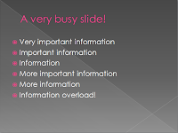
This is an example of a busy slide....

Each bullet point contains useful and/or important information.
By the time a reader makes it to the end of the bullet points, they will likely have reached information overload... and this could be only one of many slides!
The information could be split over two slides or we could use one slide and make clever use of Custom Animations applied to objects.
Directions are based on PowerPoint 2007 and the goal is to make text box 1 appear, then fade, with text box 2 appearing second.
You may find it useful to print out this page before you start.
Step 1
Create a Title and Content slide e.g. “A very busy slide!”
Step 2
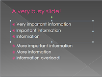
Create two text boxes and type three bullet points into each as shown below. Text box 1 is already selected as shown below (it has a solid blue outline).

Step 3
With the text box selected, click on the Animation tab to open various options. Click the Custom Animation button. A task pane will open. This is the area where you can adjust the timings, speeds, delays etc and preview your handiwork.
Click the Add an Effect button and make your choice. Bear in mind the audience you are creating the presentation for and use appropriate animations.

(animation task pane)
Step 4
To have the selected text box appear shortly after the slide opens, select Entrance, then Fade. The text box will gradually appear on the slide.
Step 5
To have the same box fade out again, click on the text box to re-select it (making sure the outline is solid blue), click the Add an Effect button but this time select Exit, and then Fade.

Text box 1 will appear and then disappear from the slide. Since we would like our audience to have the time to read the contents, we need to adjust the timings of the second animation. Clicking the drop-down arrow of the selected animation will open up further options, one of which is Timing...
Click Timing... and set the animation to start after previous (ie once the fade-in has finished) and delay to 10 seconds (you may need to make this longer depending on how much information there is to read)
We now have two animations associated with text box 1. The final part of editing this slide is to add an animation to the second text box.
Step 6
Click Add Effect button and select Entrance and then Fade.
Using the Custom animation pane make the following adjustments to this animation. Set the animation to Start After Previous. This means that the appearance of text box two will start after text box 1 has faded out.
The end result is that text box 1 appears, then slowly fades and text box 2 appears and remains on the slide.
This is just the beginning...
For the more adventurous user, there is the option to use Motion pathways to guide objects across a slide... a topic for another blog post.
No comments:
Post a Comment